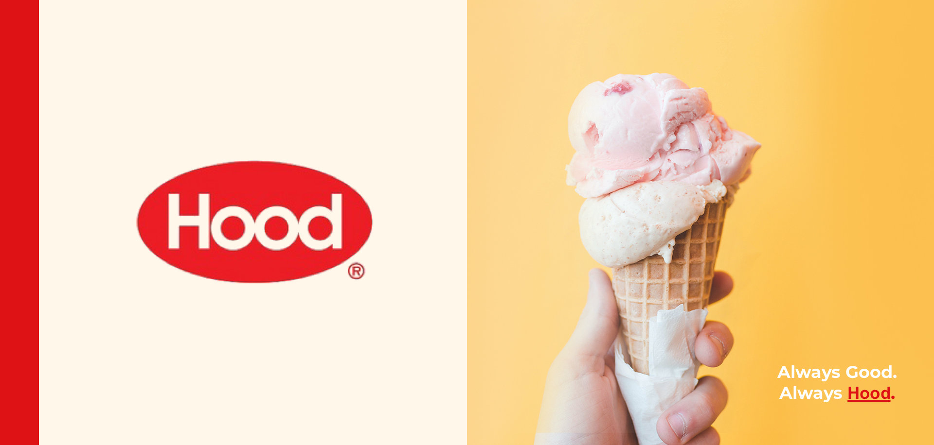
Hood Dairy
For more than 170 years, the name Hood has been synonymous with fresh, quality dairy products that taste great. Hood is a national company distributing dairy products throughout the United States. It's now one of the country's largest branded food and beverage companies throughout the United States. Superior product quality and innovation for Hood customers is pivotal in all aspects, including design.
The goal is to create an experience that targets consumers seeking all things Hood. Whether it's products, learning about their farms and processing plants, or being a part of the Hood brand. The first touchpoint was to create a home and product page that customers will enjoy both structurally and aesthetically. From concept to execution, the goals of a successful online identity and e-commerce platform will separate Hood from its competition
UX Design -- UI Design -- Art Direction
The Big Picture
Dairy is a vital part of a persons diet. Millions of people consume dairy products every second of each day. Hood has grown from a New England based dairy company to a nation wide, 13 processing plant national company. Because of this, their online brand and presence is in vital need of a refresh.
Website Assessment
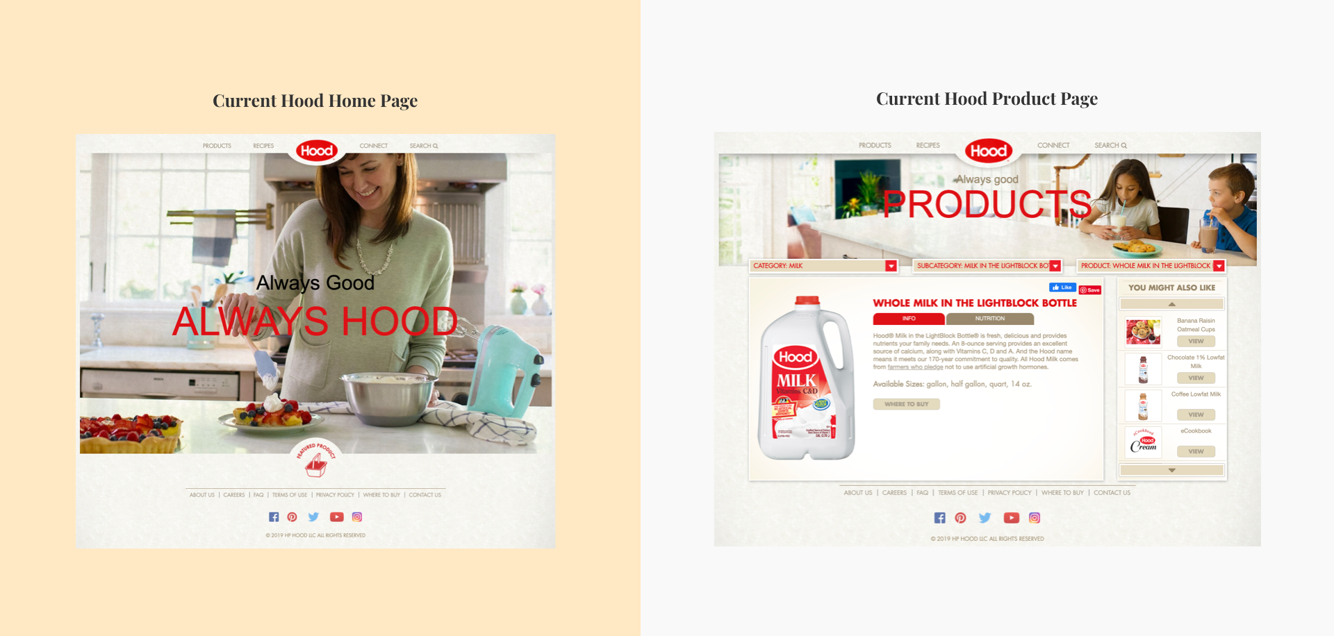
When first accessing the site there is a photograph of a woman putting whipped cream on a piece of berry pie with the slogan "Always Good. Always Hood" this creates a warm experience and immediately the reader recognizes that whipped cream is Hoods and makes that dish taste even better. Hood's existing site does a very good job with this but when speaking with two users who have never visited the website before they were confused about where to go.
As I continued looking at the site for the first time, I realized that there is top menu navigation that displays where to go but the page lacks an action button. As a user where am I supposed to click when accessing this website? There is no brand story, no engagement. Hood is a well-known brand, but on their website, what exactly do they do? These questions quickly lead to my assumptions...
My Assumptions
1. Customers know to click on the navigation on top.
2. Where to buy button means no e-commerce platform. Must sell through retailers.
3. Customers most likely don't get past homepage due to no CTA.
4. Bright photos and happiness create a positive vibe, but confusion creates an exit.
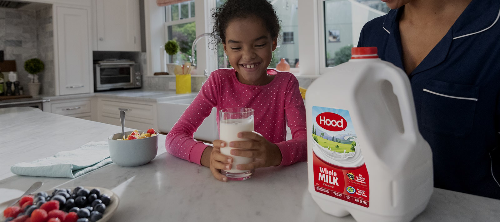
5. Core products are Milk, Ice cream, and coffee creamers.
2. Where to buy button means no e-commerce platform. Must sell through retailers.
3. Customers most likely don't get past homepage due to no CTA.
4. Bright photos and happiness create a positive vibe, but confusion creates an exit.
5. Core products are Milk, Ice cream, and coffee creamers.
The Other Guys... A Comparative Analysis
We can't begin rebuilding a brand without checking out the other teams. Hood is one of the biggest players in the dairy game, but their online presence is dramatically different than their competition. Each one of the other companies wants their users to know they are more than a dairy farm. They're brands that are impacting their customers and changing the world of farming and dairy processing. The missions of these brands are to show that something as vital In your diet as milk, is still game-changing
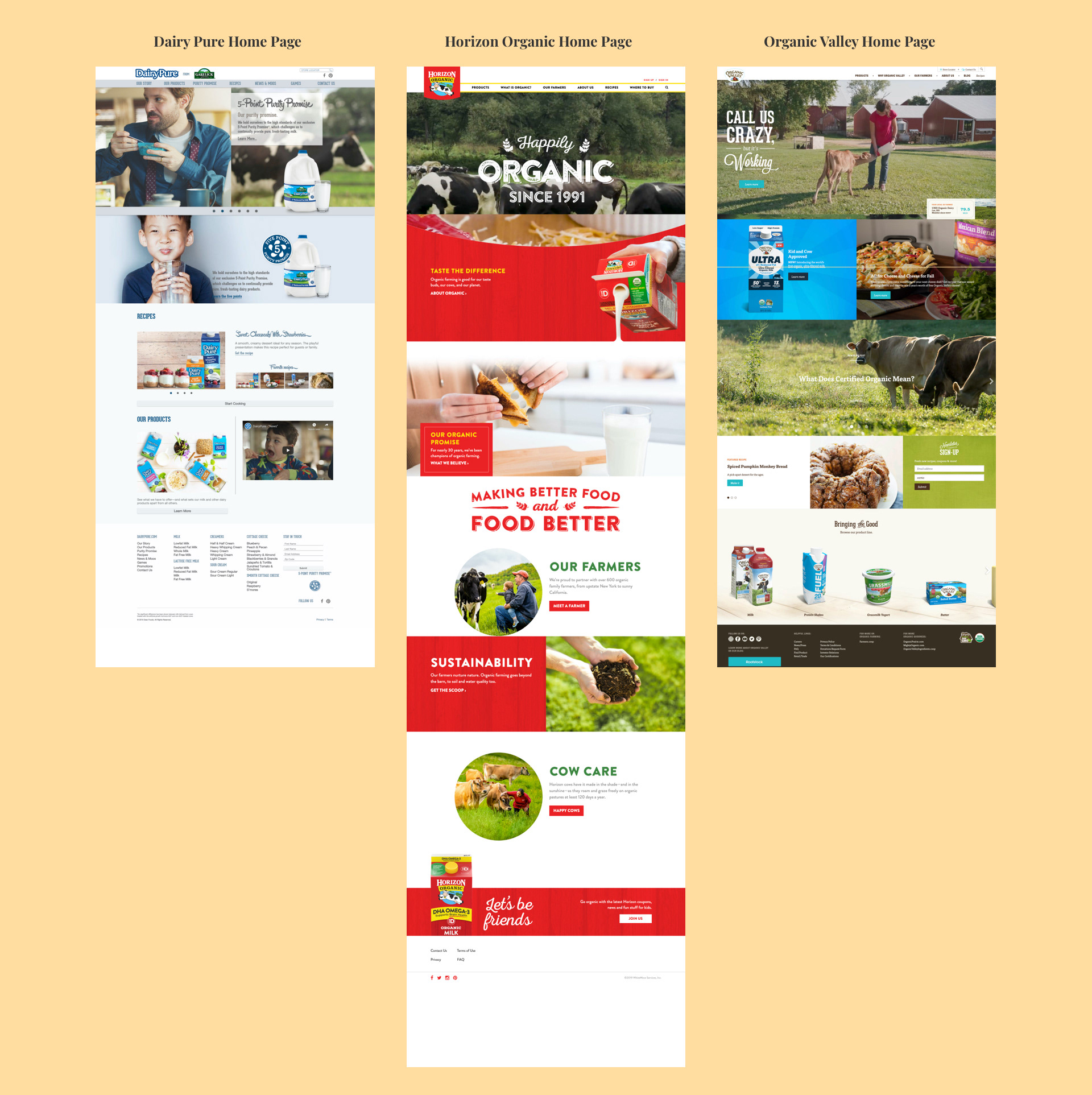
Dairy Pure
The home page shares the story of the brand, wants its customers to know that milk is an essential part of your diet. Heavy focus on kids, recipes, and purity. They use the finest cows and finest processing equipment to create their best products. Their website focuses on families, specifics parents and children drinking glasses of milk together or sharing cookies. Their brand is milk is essential for healthy living and healthy family life.
Horizon Organic
Homepage background video consists of cereal, cows, cookies, grilled cheese, and milkshakes. The best foods with milk as the staple. Pasted right under is the words "Taste The Difference." Their mission is to show that your favorite foods will taste even better by using Horizon Organic milk. Aesthetically, Red and White brand colors are all over. Their website pushes that organic and grass-fed cows create better food and a better way of life. Drinking their milk isn't just healthy for your diet but it's making a difference in your life.
Organic Valley
The homepage has the slogan "Call us crazy, but it's working" which immediately draws the reader in. You want to know why they are crazy and what is it that is working? Are they successful? Are people buying their milk more than ever because they're crazy and we're into that? They have a different approach than their competitors. Their goal is to show how much they care for the animals and their organic farms around the country.
Sketches and Wireframes
Sketched interfaces to illustrate a new product and website experience. Based on sketches, low fidelity wireframes and a prototype was created for usability testing. Due to time constraints, two usability tests were made per page along with iterations on visual design from user feedback.
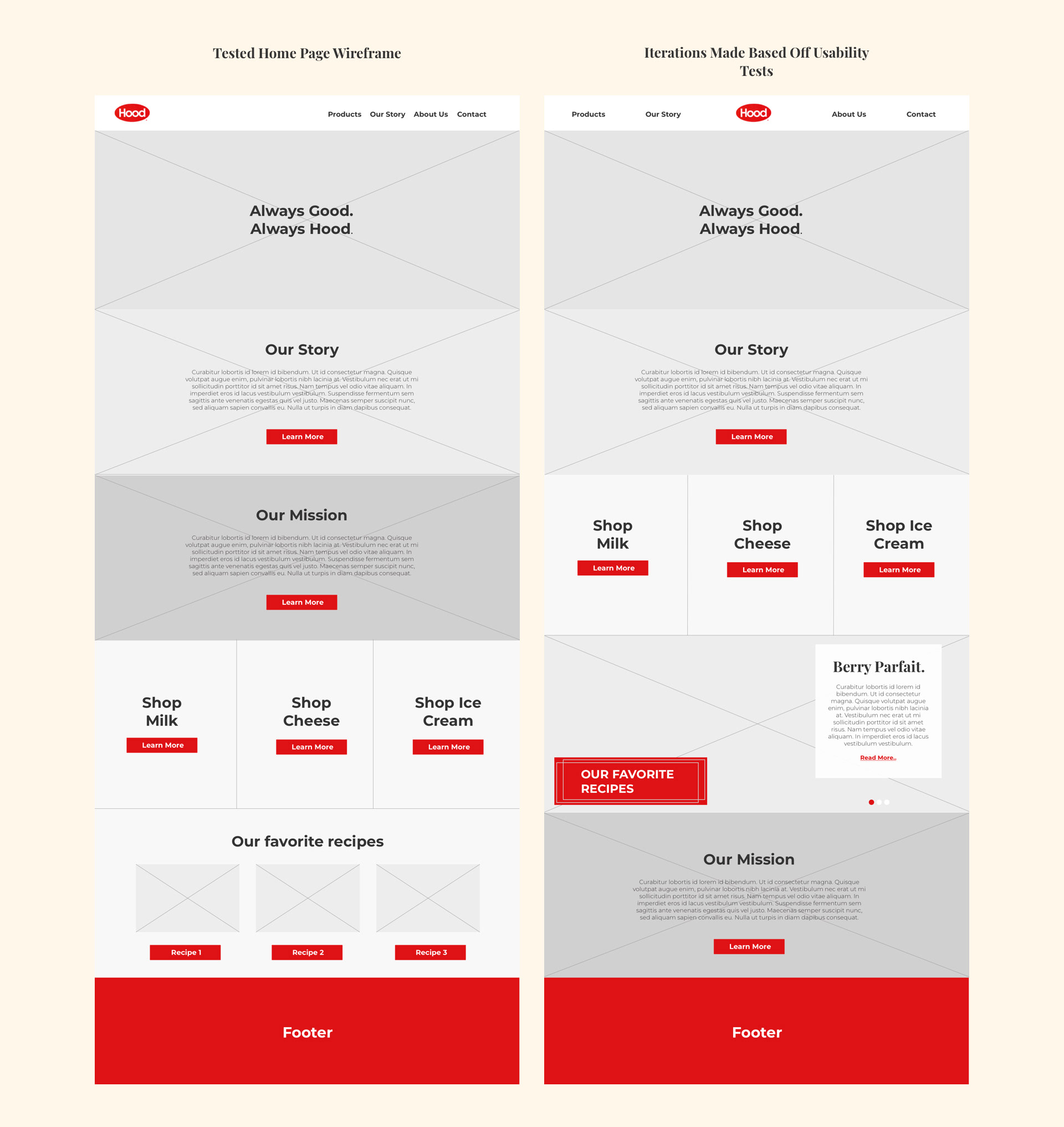
After an initial round of testing on my sketches, I chose to have Hood's story first over the products because I wanted the viewer to read about the brand, their mission and story before clicking on an item and further purchasing it. This tactic was heavy in our competition and I included that aspect so that people would learn more about Hood and why they refreshed their online identity.

Wireframes and Iterations
Created wireframes based on iterations of sketches. Due to time constraints, only 2 usability tests were done with the first wireframes. Iterations based on those tests were used for the final wireframes.
Home Page Iterations
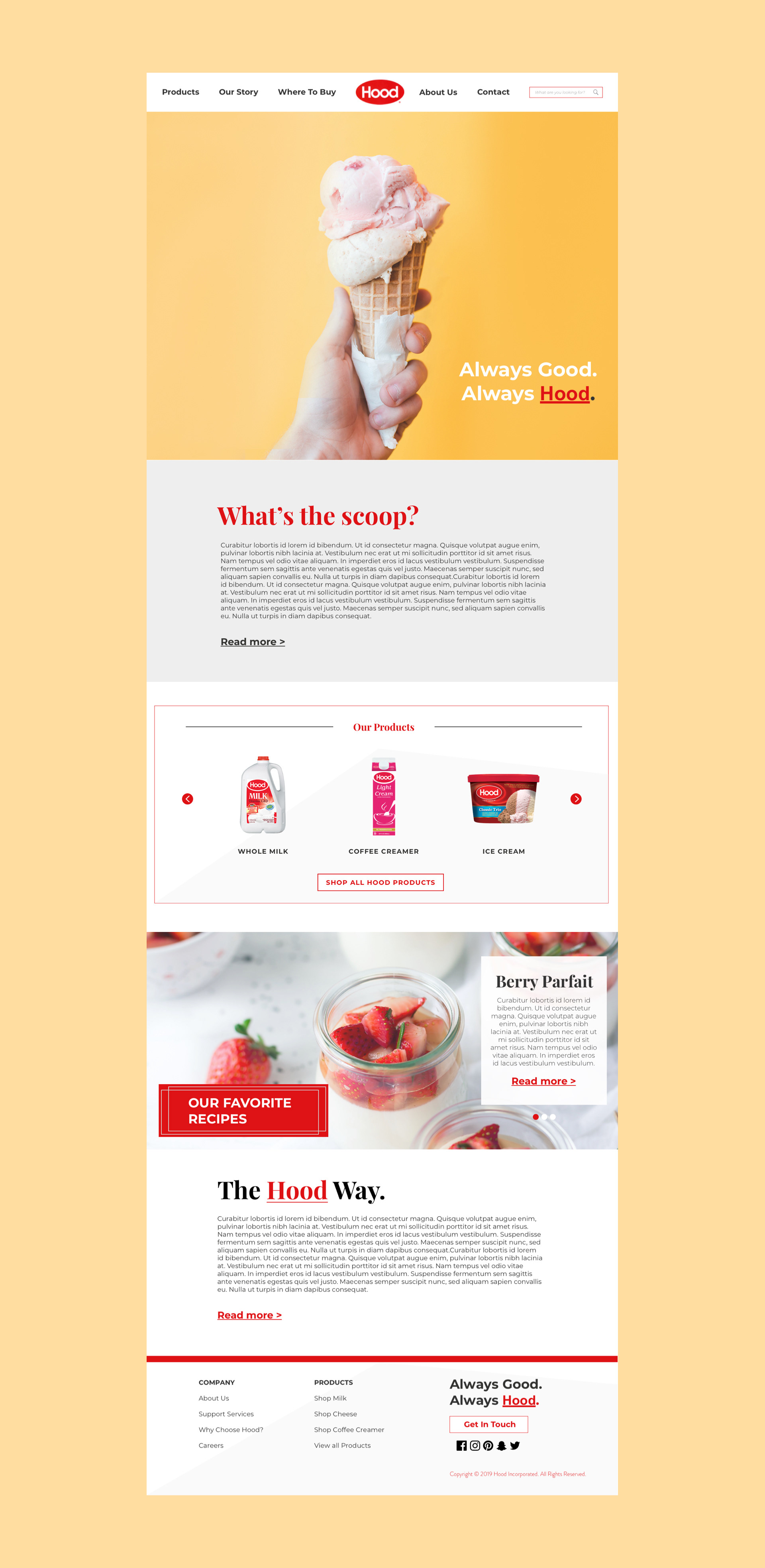
The navigation was the first item that was changed. After conducting both usability tests and AB testing the wireframe with the current Hood website, I decided that having center navigation would stick to Hood's current branding and theme and allow previous users more comfortability and ultimately adaptability.
When testing the home page, both users were adamant that on the first wireframe there needed to be another break in the text between our story and our mission. I determined that having "Our Story" and "Our Brand" stacked on each other was too much of a text block and they needed to be separated by the products.
During the interviews, both of the users were curious about the recipe section and said they would love to see more information on the recipes to entice them to click on the "learn more" button. Because of this, I chose a full-width photo of the recipe with a small text box for a description. My goal for this section is that of a restaurant menu, to have an image of a dessert or food that makes you hungry enough to click on the recipe and ultimately make you buy the dairy products needed for this recipe.
Product Page Iterations
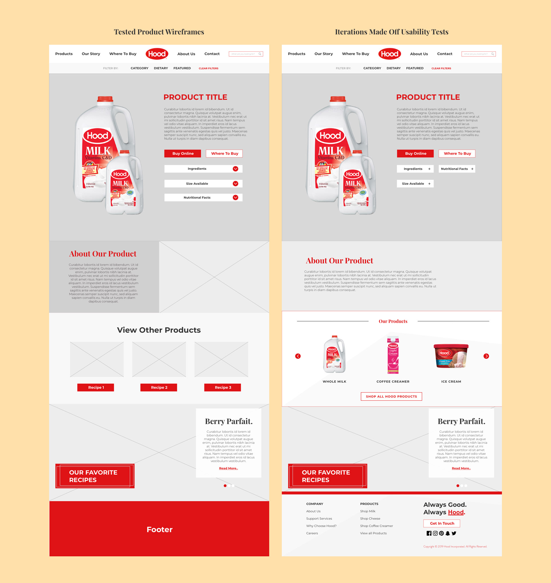
After testing the first product page with users and AB testing them with the current Hood site along with Horizons product page, the first major change was removing the down arrows on the additional information tabs and replacing them with plus signs. This keeps current with modern UI and both users determined that it was more familiar with them.
The removal of a side by side block for a description of the product was a visual choice that I made as I felt a photo there would take away from the product photo. The goal was a text block that describes the milk product. In this description, there would be information on the farms, the treatment of animals and the dietary needs that dairy fulfills. Reading all of this would entice the buyer that they are supporting a brand that cares for their animals as well as their customers and how much you need this product in your pursuit of healthy lives.
My main focus was working with the research and talking to the users about the product section. My original idea was banking on my assumptions about Hood's main products and showcasing them there. But I quickly found out that in my two user interviews, most people are not buying just those 3 products, they are buying multiple other products as well.
I chose a system that allows featured sellers and products to be displayed but also gives customers the option of clicking through different products until they liked what they saw and wanted to read more about that product by clicking on the button below. In the usability test with this wireframe, both users felt I solved that problem well and ultimately felt that finding more products that Hood makes, would entice them to come back and buy.
Visual Design and Final Product
After rounds of iterations on the wireframes above, it's time to move into visual and UI design. My goal for the visuals was engaging photos that made your eyes glow and your stomach growl. As dairy is one of the main components of our diet, and ice cream is easily the best dessert, having that as a landing image with hood's slogan "Always good. Always Hood." allows the users to react positively and identify with Hood's delicious ice cream. We see this same style in the recipes section, with a snip-it of the recipe, to entice the users to click, purchase and re-create.
The color scheme was aligned with Hood's branding on their current website. Hood's staple color red is vocal in the re-design for better adaptability and familiarity with their current customers.
. 


The Finalized Product.
Redesigned Hood Incorporated's product and homepage that allows users to find specific information on products while demonstrating a commitment to quality and engagement.
The new product and home page better engage the users and moves Hood to be more in-line digitally with their competition. By elevating their online brand and identity, and improving their e-commerce and website experience, Hood will increase their website traffic and user engagement which will improve their business goals and profitability.